Aged & Infused: A Flavorful Brand System, Built to Grow
The early years of Aged & Infused were simple, yet they grew quickly so their brand wasn’t thinking ahead, it was reacting. Our role was to establish a flexible foundation of visuals so that the brand could expand as the business continues to grow.
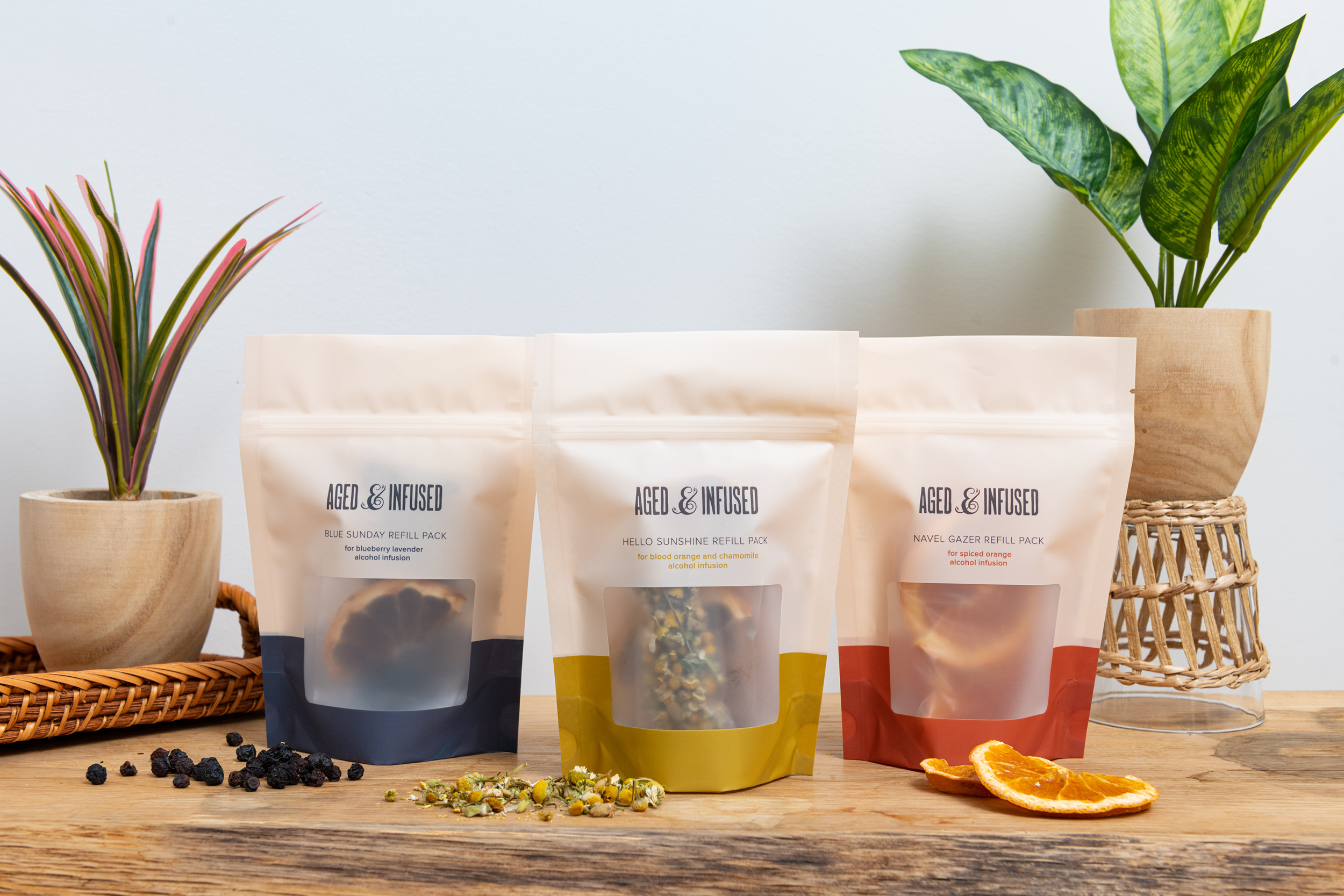
Inspired by their clean, natural ingredients, we created a packaging system that future flavors could play well within, created an illustration set and pattern to reinforce the playful side of the brand, and established a photography style that captures the brand’s approachability and flexibility.
SERVICES PROVIDED
INDUSTRY
Brand Refresh
Packaging System
Color System
Illustration
Print Collateral
Shipping Material Design
Sub Brand Development
Consumer Packaged Goods
CLIENT SINCE
June 2020
THE STRATEGY
THE WORK
The Logo
Aged & Infused already had a logo with some local clout when we came on board. We refined the logo's letterforms and kearning, and redrew their signature ampersand to create a more balanced, rhythmic composition, without sacrificing the recognizability they’d already worked hard to build.


Color System
Aged & Infused’s extensive, ever-expanding list of flavors, demanded a flexible system for product differentiation. We responded by creating a dynamic color system, with each flavor represented by a color. Grouped according to season, the flavor colors form rich tonal palettes for the brand to draw on, mixing and matching to create near-endless variations, all with a distinctly “Aged & Infused” feel.
Illustration
From the people at it's core, to the product itself, Aged & Infused has a spirited, joyful energy that was missing from the brand's previous visual language. We created an illustration set and pattern in a playful, off-kilter style to reinforce these facets of the brand's personality, while running a unifying thread across the plethora of colors.
Packaging
Inspired by the clean, natural ingredients in Aged & Infused's infusion kits, we created a flexible, minimalist packaging system that future flavors could play well within. As the company grew, they introduced a new product, the Traveling Bar Cart. We created a sub brand for the new product, including all new belly band packaging as well as a deck of custom branded playing cards.
Photography
With a majority of A&I’s first impressions happening online, it was important for us to build a rich and inviting visual world for the product to inhabit digitally. We collaborated closely with a talented photography/food styling team to establish a casually approachable photographic style, focused on moments of relaxed social connection.
We embraced naturalistic photography, placing the product in colorful, unfussy social settings alongside attainable bar set-ups and people, at ease in their environment.
Photographer: Morgan Ione Yeager
Cocktail Stylist + Props: Brooke Doyle
Andi is a true color queen and an all-around amazing designer. We came to her in 2020 with the large task of re-branding our company, Aged & Infused, from the ground up.
Not only did Andi take the time to really get to know A&I, but she also created a beautiful color story, packaging, website, and aesthetic that brought our story to life and has without a doubt helped our business grow. We’re so excited to continue evolving with such a collaborative, talented, and like-minded partner.
—Jess Feller, Co-Founder of Aged & Infused


